
WASHINGTON, May 31, 2026, 14:10 EDT
- Between 2014 and 2022, NASA’s Black Marble maps picked up a 16% net increase in global nighttime artificial lighting. Some big areas, though, actually got dimmer.
- Governments and companies now have a clearer tool for monitoring electrification, outages, conflict damage, gas flaring, and light-pollution rules, thanks to the new data.
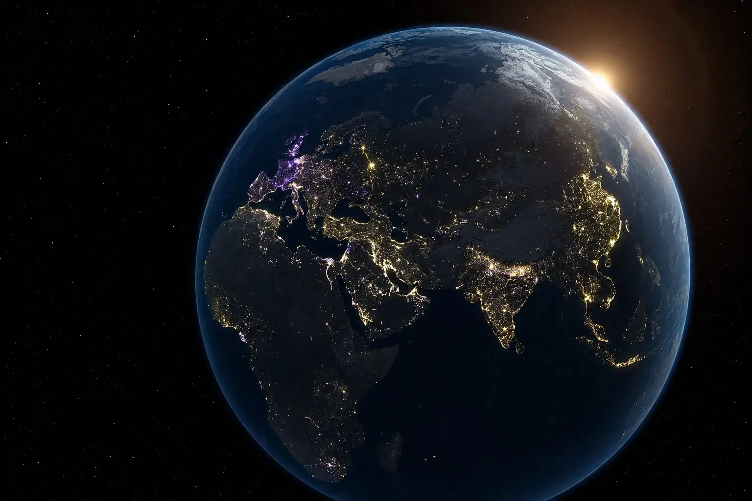
NASA’s satellite data reveals Earth’s nights aren’t brightening in a uniform pattern; instead, the latest Black Marble imagery captures a chaotic mix—some areas glow more, others fade. Cities, conflict zones, shifting energy policies, oil extraction, even economic downturns—they all trace out this irregular mosaic.
Why does it matter? Artificial light at night isn’t just tracking city sprawl anymore. Researchers now turn to these nighttime glows for near-instant reads on everything from electricity access to industrial churn, disaster response, even signs of social unrest — all caught from space after sundown.
The discovery complicates the straightforward narrative around light pollution. Sure, some regions go dim thanks to energy-saving measures or better shielding, but darkness elsewhere often points to power grid failures, economic downturns, or battered infrastructure.
Researchers published their findings April 8 in Nature, analyzing daily nighttime satellite images to track artificial light at night (ALAN)—a term scientists use for human-made lighting after dark. They reported that the world saw a net 16% increase in artificial brightness by 2022. The data shows a 34% boost over the 2014 global baseline, offset by an 18% reduction from dimming.
NASA’s Earth Observatory credits the maps to Black Marble data, sourced from VIIRS — short for the Visible Infrared Imaging Radiometer Suite — mounted on Suomi-NPP, NOAA-20, and NOAA-21 satellites. VIIRS tracks faint light across green to near-infrared wavelengths, distinguishing city lights from moonlight, cloud cover, snow, and atmospheric interference.
Urban sprawl in China and northern India lit up Asia, with sub-Saharan Africa and Southeast Asia also seeing a jump in brightness thanks to expanding grids and new infrastructure. Across Europe, though, the trend flipped: France, the United Kingdom, and the Netherlands all recorded significant dimming, a change tied back to tighter energy efficiency rules and stricter light-control efforts.
Across the United States, the picture was mixed. NASA noted that cities out West grew brighter alongside population gains, but large stretches along the East Coast actually dimmed. Researchers pointed to increased use of efficient LED lighting and ongoing economic shifts in those areas. Out in the central oil and gas fields, a different story played out—abrupt bursts and drops in nighttime light tracked drilling activity and gas flaring at the well sites.
“Earth at night has so much to teach us,” said Miguel Román, deputy director for atmospheres and data systems at NASA’s Goddard Space Flight Center. Deborah Gordon, a methane expert with the Rocky Mountain Institute and not part of the research, was more direct: “Flared gas is money burned.” NASA Science
The conflict signal stood out. UConn reported that their data showed persistent dimming over Ukraine following Russia’s 2022 invasion, with similar darkened regions showing up in Syria and Yemen. Traces from COVID-19 lockdowns and the energy crisis in Europe also appeared in the record. “Heartbeat of society,” is how Zhe Zhu, a remote-sensing professor at the University of Connecticut and the study’s senior author, summed up the changes. UConn Today
With Black Marble, it’s all about frequency. Where earlier night-light research mostly used annual or monthly averages—blurring out abrupt changes—NASA’s Scientific Visualization Studio has gone the other way. Their latest animation draws from a decade of daily satellite images, marking areas in gold for increases, purple for decreases, and white where both trends appear.
Still, there are real gaps in what these readings show. According to Nature, VIIRS mostly picks up upward-facing light after midnight and is tuned to wavelengths in the 500-to-900-nanometer range. That means it misses a lot: lighting from earlier in the evening, and much of the blue-rich output from newer LEDs. So, a location might seem darker in satellite data, but that doesn’t guarantee the on-the-ground light pollution has actually dropped.
The takeaway isn’t as neat as the images suggest. Earth’s getting brighter, but these night maps have turned into something like an accounting tool for human presence—fresh highways and grids lighting up here, strict conservation dimming things there, elsewhere a blackout or conflict. That patchwork makes darkness tougher to interpret for researchers and officials, but it’s also turned those shadows into valuable information.